
"Since the turn of the millennium, Europe has been undergoing some pretty intense demographic change.
...
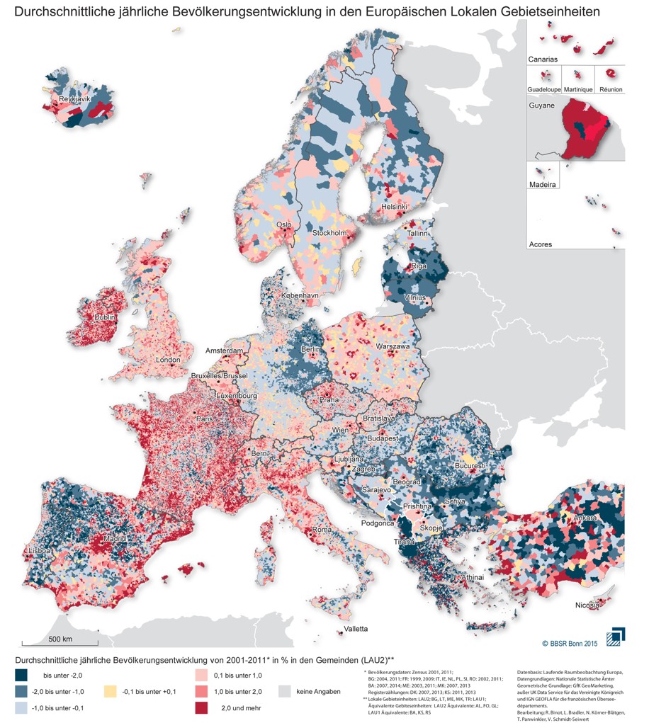
The BBSR collected data between 2001 and 2011.
...
The map works as follows. Dark blue patches show an average annual population fall of 2 percent or more, the medium blue patches a fall of between 1 and 2 percent, and the lightest blue patches a fall of up to 1 percent. Areas in beige have experienced no statistically significant change, while the red areas show population growth. Municipalities in deep red have experienced an average annual population rise of 2 percent or more, the medium red of between 1 and 2 percent, and the pale pink areas of up to 1 percent."
Imagem e trecho retirado de "An Incredibly Detailed Map Shows Europe's Population Shifts From 2001 to 2011"
%2006.21.jpeg)


Sem comentários:
Enviar um comentário